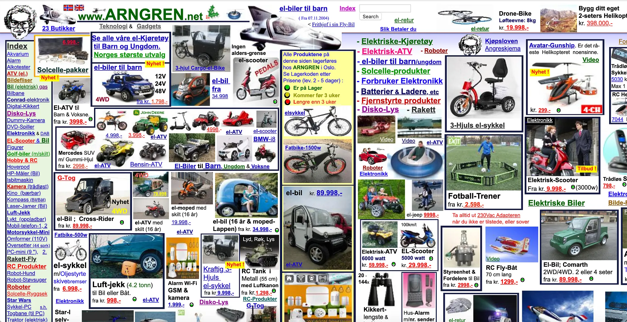
AN ADVICE FOR ARNGREN WEBSITE
We live in society where we are most comfortable on things that are pleasing to eyes. But look at this website, a very well-known due to its shortcomings and unfortunate graphic and web design. People wonder if this site has been effective or attractive at all. I have been also hauling for online shopping - but yet if I stumble upon to this shopping area, I may click the exit button not even a second. So well, here are my short and well-thoughts about www.ARNGREN.net.
As a student who knew the different elements of design and principle design, what advice can you give to the creator of Arngren website to make it more attractive?
As a reader and teenager, I would
like to advise the creator of the Arngren website to develop, advance, and launch a
innovative and proper design on their site to be more effective in delivering
their purpose, service, and message to the readers by arranging, create more
space, least possible words, and eradicate overlaying pictures. In my basic
knowledge, it would be best for them to practice utilize the fundamental
principle and elements of design in graphics and layout wherein they weigh the
distribution of all icons, pictures, shapes and lines, concise pattern, maintain
proximity, consistent pattern, recreate contrast and space. For an effective
website design, structured pages are vital – they should make their site look
neat and is also easy on the eyes.
Moreover, the finest way for
Arngren could acquire and change their webpage would be to adding tabs, links,
marks, and create a homepage for organizing every key point or section to
create it apprehensible, compatibility, brief industry-appropriate design, and clean navigation for a normal reader. It would help if they create uniform
themes and images in subjective
detail. In conclusion, they should have reviewed their webpage (from the reader’s
perspective) and innovate it to better visual presentation.

Comments
Post a Comment